Celebrity Roasting for Jaguar, Toyota, Range Rover and Mini

We looked at 4 SUV manufacturers in Canada — and we ROASTED their landing pages, according to our intensive 27-point Landing Page Checklist.
Our checklist breaks down into the four main categories of background & planning, page elements, design and functionality. In other words, we check how closely the page aligns with its intended goals, how effectively the page elements inspire the user to take action, how smoothly the page’s design guides the user to the right place, and how well the page loads and behaves on all devices.
We’re about to find out how well these auto companies’ landing pages stack up in all four of those areas.
But before we start, I want to mention two major problems with ALL FOUR of these pages:
- No gated content.
I saw nothing on any page that asked users to provide their names and emails in exchange for a product brochure (or some other cool downloadable content).Gated content is a CRUCIAL part of any conversion process, because it allows you to nurture potential customers with relevant information and special offers.Clicks aren’t cheap. Whether a prospect buys from you or not – and it’s usually “not” – you NEED to capture their contact info, so the money you spent on that click doesn’t go to waste. - No social proof.
I didn’t see any positive social media comments, likes, tweets, official trust symbols, ratings or accolades on ANY of these pages. I mean, seriously?!People are 71% MORE LIKELY to buy if they can see a product has a positive reputation on social media – especially if those comments are coming from people they know.Why would you want your prospects to be 71% less likely to convert? I honestly have no idea. That’s a question for these auto marketers.
Let the roasting begin.
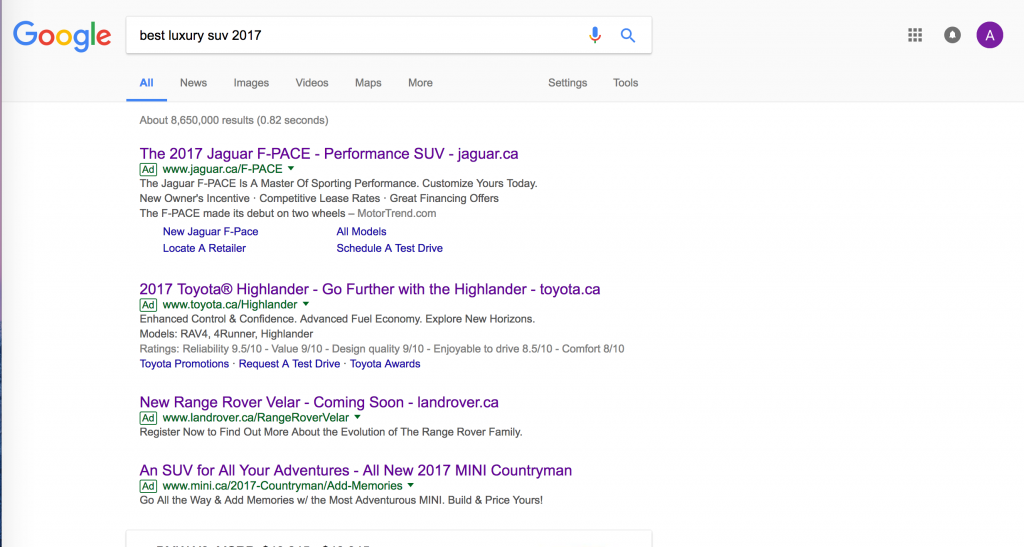
Our first step was to search “Best luxury SUV 2017” on Google.

1st Place | Mini Countryman – WINNER!
Pros: Out of the four pages in this roast, this one is by far the cleanest, clearest and most direct. The subscription form is a great idea (though it could be done better), there’s a clear CTA (though it’s in the wrong place) and the outbound links are kept to a relative minimum.
Cons: Too many pop-ups. Too much navigation. But the bigger problem is, this page makes too many assumptions about why I’d want a Countryman, and what it apparently means to me. The first CTA is too soon, the form comes on too strong, and the videos assume I’ll want to click play without giving me a reason to.
Watch Mini’s Countryman’s Roasting Video
Roasting Checklist Analysis
- Background & planning
From the moment I land on this page, I see loads of keywords that match up well with my search terms, and with the Google ad. That’s a great start. This page should have no problems getting ranked at the top of relevant search results. - Page elements
What is the headline talking about? It doesn’t connect with my pain points, OR with my search terms. “The New Mini Countryman” should be right up at the top of the page, followed immediately by a clear CTA. Mini is the first company in this roast to offer a form where I can subscribe – but the offer is crappy. Why would I want to subscribe to a newsletter? Why aren’t they focusing on MAIN CTA, which is “book a test drive?” And while the videos are a good idea, I don’t see any clear reason to watch them. Ooh, a picture of a car with an arrow on top. How does that make me want to click “play?” - Design
What the hell is up with all these pop-ups?! As soon as I land on the page, my browser is swarming with them. Although this page has the LEAST amount of unnecessary navigation, out of all those in this roast… it still has WAY too many links. The only good news is, most of them take me elsewhere on this same page. Also, why are you asking me to “book a test drive” BEFORE you’ve shown me any clear reasons to buy? Then further down, once you’ve shown me those reasons, you stop giving me CTAs. Um… what?! - Functionality
The page loads well on mobile, but I had trouble scrolling on mobile and desktop both. Anyway, the title and description meta tags line up with the copy, so that’s all right.
2nd Place | Toyota
Pros: On the whole, this page offers a nice smooth experience. The design is fairly clean and minimalist, and takes me through each vehicle and selling point one-by-one.
Cons: This page has WAY too many links offering to take me somewhere else. But even more importantly, it has a whole lot of “sort-of-CTAs,” when it should have ONE that’s impossible to ignore.
Watch Toyota’s Roasting Video
Roasting Checklist Analysis
- Background & planning
Lots of good SEO keywords here. It’s clear that this page is the general sort of place I want to be – but notice that the Google ad was focused on the Highlander, while this page’s headline says “SUVs and Crossovers.” This immediately makes the visitor wonder whether they’re actually on the right page. - Page elements
The headline is clear – though not quite aligned with the ad, as I said above. The subheader is solid, too. And I like the little blurbs beneath each vehicle. Short and sweet. But while I see a whole lot of copy from Toyota, I don’t see any customer reviews, comments, ratings or certifications that’d reassure me this is a vehicle worth buying. - Design
The navigation is smooth and clean. Not too many nav bars… but still, quite a few links throughout the page, and a WHOLE lot at the very bottom. Every one of those dozens of links wants to take me AWAY from this page and its CTA. And speaking of the CTA… um… where is it?! I see a whole lot of “sort-of-CTAs,” but not one clear central call to action. - Functionality
The page loads nicely on mobile, and the navigation is just as smooth as on desktop. The meta tags, including title and description, fit with the ad and the page copy.
3rd Place | Range Rover Velar
Pros: This page was off to such a good start. I love the headline, and the CTA right under it. And on the whole, the page’s design could look gorgeous, if someone would just clean it the hell up.
Cons: Too much navigation. Too many different CTAs. Too many conflicting messages. Too many outbound links. If anyone manages to figure out what this page actually wants from them, it must be by sheer luck.
Watch Range Rover Velar’s Roasting Video
Roasting Checklist Analysis
- Background & planning
This page’s headline lines up extremely closely with the Google ad that brought me here. Right away, I’m certain I’ve landed on the right page. I also see a lot of relevant SEO keywords. All those factors will combine to keep this page’s rank nice and high. - Page elements
The headline is short, clear, and straight to the point – followed immediately by a CTA to view the interior. We’re off to a great start. But things quickly get confusing as I scroll down, and see four different CTAs, followed by a whole lot of different messages, pulling my attention in a dozen directions at once. And the text rambles on… and on… and on, longer than anyone can be expected to pay attention. What am I here to DO, again? - Design
Help! I’m drowning in navigation! I count not one, not two, but THREE nav bars up at the top, a nav bar below the first photo, a scrolling sidebar on the right, and dozens of other links peppered throughout the text. Every one of those links wants to take me AWAY from this page. Some of those links actually take me back this same page, which confuses me even further. And with so many conflicting CTAs, I have no idea what action I’m supposed to take here. - Functionality
The page looks consistent across desktop and mobile… though the navigation is even MORE oppressive on a small phone screen. All the meta data is filled out correctly.
4th Place | Jaguar F-Pace
Pros: I’ve gotta give this page props for good copy. Jaguar comes across as suave, confident and cool – and the page is very up-front about what it’s offering.
Cons: By filling this page with so much irrelevant navigation, Jaguar completely surrenders control over the user experience. It’s far more likely they’ll head off to some other page on the site – or just get frustrated and leave – than manage to find and click the “hidden” CTA button.
Watch Jaguar F-Pace’s Roasting Video
Roasting Checklist Analysis
- Background & planning
On the whole, this landing page’s text and images line up with my search keywords. That’s a good start. I see a lot of SEO terms that fit with my search term, which means this page will get a high Google page-rank. - Page elements
The headline and subheading are nice and strong. They immediately speak to my interests and catch my attention. In general, the copy demonstrates authority, which is good – but it’s also pretty vague. For all the cool-sounding language, this page doesn’t raise a specific question or pain point. There’s no social proof in the form of comments, ratings or certifications. - Design
WAY too much navigation! As soon as I arrive on this page, I’m greeted with not one but TWO nav bars, a search bar, a sidebar, two dropdowns… all of which offer to take the user AWAY from this page. And can you find the first CTA? It took me a couple minutes – it’s that tiny arrow on the road! Then below that we’ve got a second CTA, offering to let me “build my F-Face” before I’ve even had a chance to look over the features. - Functionality
The page looks just as confusing on mobile as it does on desktop, which is… a good sign? I guess? Anyway, the title and description meta tags line up with the copy, so that’s all right.


