Celebrity Roasting | Telus Mobility, Rogers Wireless, and Bell Mobility
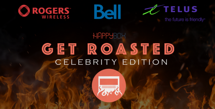
We took a look at the top three telecommunications companies in Canada — and we ROASTED their landing pages, according to our intensive 27-point Landing Page Checklist.
Our checklist breaks down into four main categories:
- Background & planning
Has the page been planned to target a precise audience with a single offer? Is everything about the page built outward from that audience and offer — including SEO keywords? Do the text and imagery on the page match up with the ad that brought the visitor here? - Page elements
Does the page grab our attention with a compelling headline? Does it raise an intriguing question, address a specific pain point, and present a clear solution? Does it demonstrate authority and build trust? And most importantly of all, does it have a clear call to action (CTA)? - Design
Is the page easy to scan and skim, or does it distract the reader with a bunch of unnecessary navigation and complex visuals? Does every element draw attention straight to an eye-catching CTA, or is the viewer unsure where they’re supposed to look and what they’re supposed to do? - Functionality
Does the page look and behave correctly on both desktop and mobile? Do the page title, description, and other meta data match the headline and keywords?
We’re about to find out how well these telecom companies’ landing pages stack up in all four of those areas. Let’s get into it.
Our first step was to search “Best cell phone plans” on Google.
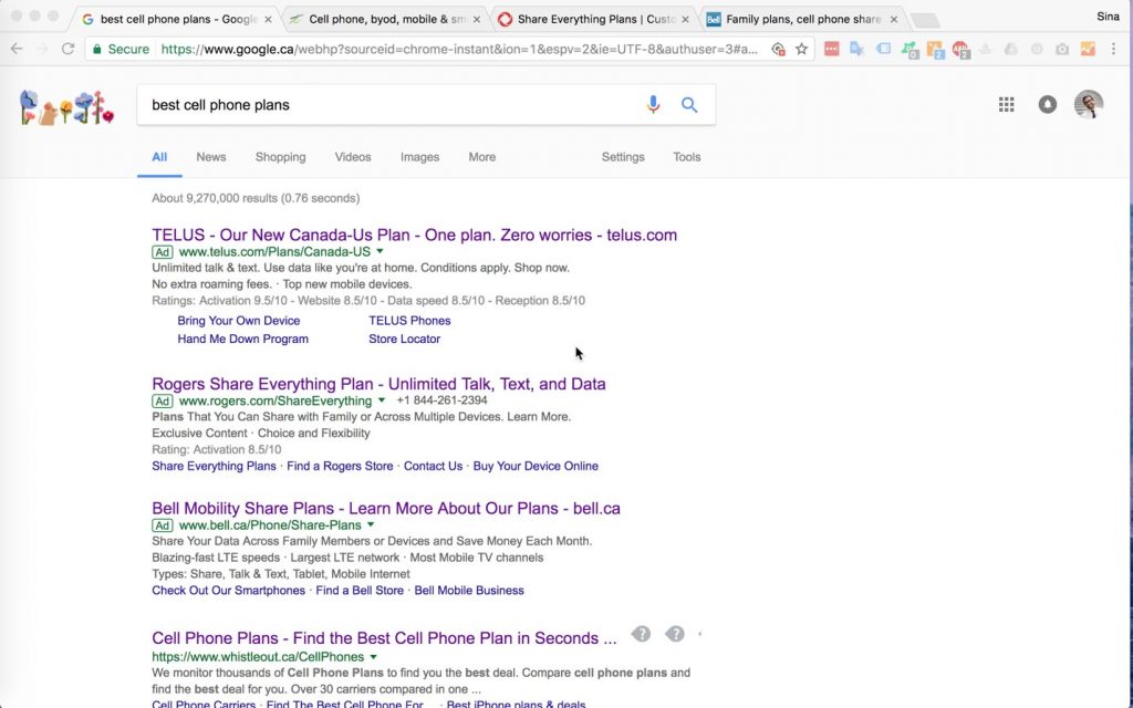
1st Place | Bell Mobility — WINNER!
Watch Bell Mobility’s Roasting Video
- Background & planning
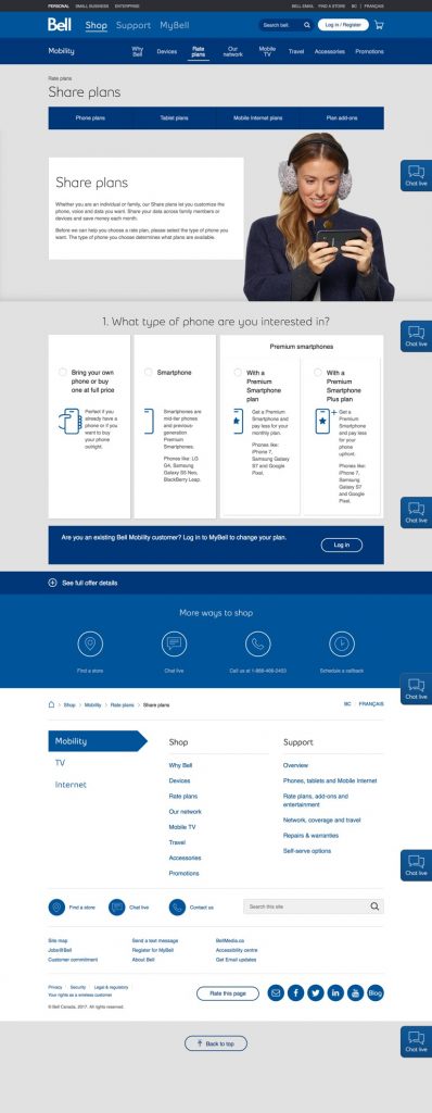
The landing page’s text and images are congruent with my search term, and with the ad I clicked. The page is also packed with relevant SEO keywords — all of which immediately tells me I’m in the right place. The page then gives me a very simple menu, where I can choose which type of call phone plan I’m interested in. - Page elements
The clear headline and subheadings stand out right away. Simple, high-contrast visuals keep me focused on the central text and graphics. On the other hand, there’s nothing to tell me why Bell’s solution is the best — or to prove why anyone else thinks so. Worst of all, this page lacks a single clear CTA. In fact, there’s no specific action above the fold. - Design
There’s nothing in the page body itself that distracts from the main goal — but notice that unnecessary nav bar up at the top! Visual cues keep guiding me downward, where I’ve got four options to choose from, as well as a “login” button, contact info for a store, and a bunch of other info I don’t really care about. Uh… why am I here again, exactly? - Functionality
The page looks slick on mobile. The page title, description and keywords are all filled out in the metadata, and all of them match the page’s headline and content.
Pros: All in all, this page has a very intuitive workflow and selection process, with good descriptions, clear headlines, and simple imagery.
Cons: There’s no specific action above the fold, and way too many leaks distracting a visitor from the target action they’re supposed to take.
2nd Place | Telus Mobility
Watch Telus Mobility’s Roasting Video
- Background & planning
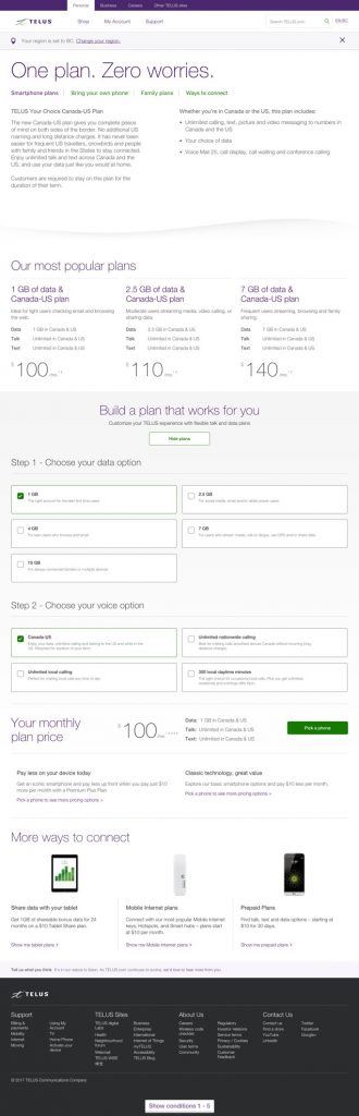
The page’s headline, subheadings and keywords all match up with the ad I clicked. But instead of addressing one specific audience with one specific message and goal, this page tries to address every possible audience at once — and ends up confusing as hell. - Page elements
That headline is dead on arrival. It doesn’t get me excited, or even address a specific pain point. I don’t see any clear benefit explanations, anxiety reducers or social proof, or a clear offer or CTA… or much of anything, besides a jumble of dry text. It kind of boggles my mind how a page can be so simple, and yet so all-over-the-place. - Design
This page feels like it wants me to do ten things at once. In addition to all the distractions in the page body, I’m also distracted by loads of unnecessary navigation up at the top. There’s nothing much happening above the fold, then the page falls apart into a chaos of distractions as I scroll down. - Functionality
The page displays reasonably well on mobile. The title, description and keywords in the metadata all match the page’s headline and content.
Pros: The page’s main message is congruent with the ad and keywords — as well as the metadata — which makes sure the visitor knows they’re in the right place.
Cons: This page tries to address every possible audience at once, and just ends up being confusing for everyone. No clear offer, no CTA above the fold, and way too many distractions.
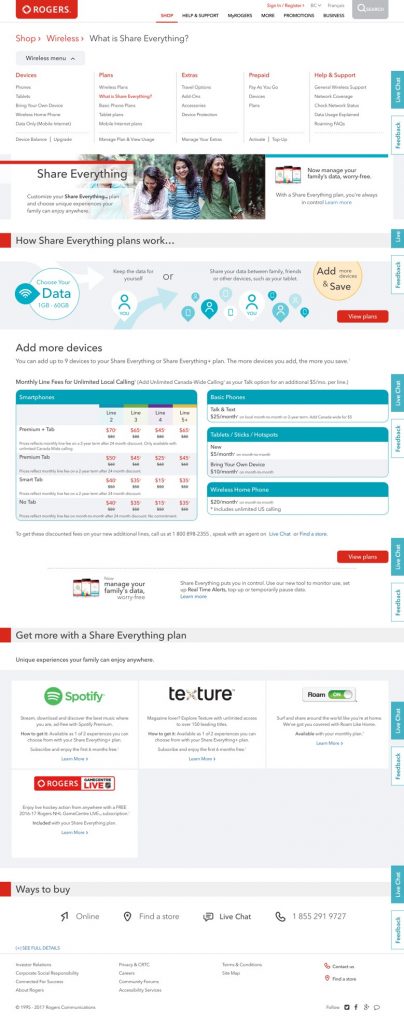
3rd Place | Rogers Wireless – HORRIBLE!
Watch Rogers Wireless’s Roasting Video
- Background & planning
I wish I knew who this page was designed to target, or what action the designer wanted them to take — but honestly, the sheer amount of conflicting messages on this page makes it nearly impossible to guess. The message matching the ad I clicked is probably somewhere on this page… but where? - Page elements
This page’s headline says “Share everything,” which seems to be the approach of its web designer. Instead of a clear goal for a precise target audience, this page immediately throws everything (including the kitchen sink) right in my face, all at once. Yet, somehow, the page still fails to make a single clear offer, or present any kind of CTA. - Design
Instead of minimal navigation, simple visuals and CTA cues, this page gives me not one but TWO separate nav bars — one of them so huge it hides most of the above-the-fold content — as well as a trail of completely unnecessary breadcrumb links. Then, as I scroll down, I see some spreadsheets I’m never going to read, surrounded by a wall of text, logos, and other conflicting links. What do you want from me, page?! - Functionality
The title, description and keywords in the metadata all match the page’s content, but are fairly vague. The page looks every bit as hideous on mobile as it does on desktop.
Pros: The ad is somewhat congruent with the landing page’s message, and with its metadata.
Cons: To call this page “unclear” would be the understatement of the year. It’s got no clear offer, no CTA, and no steps to a solution. The chaotic layout and insanely over-squeezed text make me doubt Rogers have their act together as a company — and that sucks for them.